

Web Layouts and Content Strategies That Keep People Reading

Getting and keeping readers’ attention on the internet is more challenging than ever. A website does not get much time to make its case. Visitors scan and decide whether the page feels useful, often in a matter of seconds. That means a strong web content strategy is not just about having the right information, but also about great web design.
Web design focuses on presenting information in a way that helps people understand what matters first, what comes next, and why they should keep going. Research on online reading has found that most users tend to scan rather than read word-for-word. People may read only a small share of the text on a page before moving on.
That is why engaging web design depends on structure as much as style. A page has to create momentum. It needs a clear path, visible priorities, and content that feels easy to move through.
In a digital environment where teams are increasingly incorporating UX designers, the larger challenge is not simply making a site look modern. Instead, it is building pages that guide attention and reduce friction from the first scroll onward.
Build a Visual Hierarchy That Tells Users Where to Look
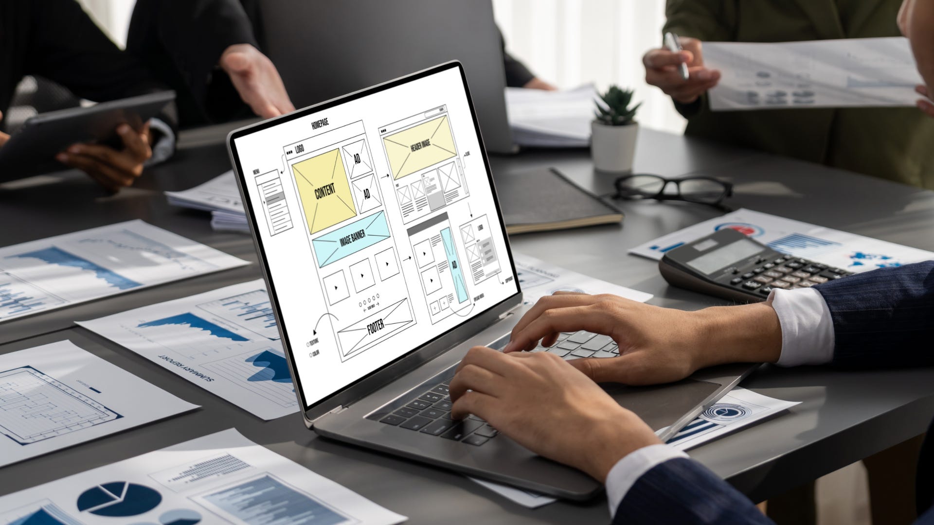
Visual hierarchy is one of the first things that separates a page that holds attention from one that loses it. It should allow users to tell what is most important without having to think too hard. This requires a visual hierarchy strategy that uses elements such as scale, contrast, and grouping to guide the eye to the right content in the right order.
In practice, that means headlines should do more than label sections. They should communicate value. Subheads should help break a complex topic into logical stages. Calls to action should stand out without overwhelming the page. White space should be used to create breathing room.
This is also where layout and story start to overlap. A homepage, landing page, or long-form article should not feel like a pile of equally weighted blocks. It should feel sequenced. Users should know what the page is about within seconds, see the next useful point without hunting for it, and understand where to go if they want more detail.
In practice, a good hierarchy lowers cognitive effort. It also makes a web page feel more trustworthy because the user does not have to decode it first.
Make Copy Easy to Scan Without Making It Thin
Scannable writing is not the same as shallow writing. It means shaping content around how people actually move through a page. This includes words, headlines, lists, graphics, and any highlighted information.
Some rules in this area mirror those found in journalism. For example, a web page should have a clear message, use facts and uncomplicated writing, and keep paragraphs short.
Section headings should carry meaning, not just clever phrasing. Key points should appear early in sections rather than get buried. Links should be descriptive enough to tell users what they will get before they click.
Readability also depends on presentation. The length of text lines can impact how easily users can process text, with overly long lines creating friction and reducing comprehension. A page can have strong information and still underperform if reading it feels physically tiring. Good web writing and good layout work hand-in-hand.
Use Multimedia to Support the Story, Not Distract From It
Images, video, charts, and other media can deepen engagement, but only when they serve the page’s purpose. Multimedia should clarify, not confuse. Using multimedia assets for their own sake can disrupt page flow and reader comprehension.
Video often works best on the web when it supplements text and images rather than replacing them, especially when users need context. That principle matters because many teams add media for energy while overlooking usability
A short explainer video can help if it answers a question quickly. An image can strengthen a section if it illustrates the point. A chart can improve comprehension if it makes a pattern easier to grasp. But media that autoplays, slows page comprehension, or hides key information can push users away.
Evan Kropp, Ph.D., is Executive Director of Distance Education at the University of Florida College of Journalism and Communications and a faculty member in the online Master of Arts in Mass Communication program. His work focuses on digital education, media strategy, and the evolving role of journalism in the modern media ecosystem.
 | A guest post by
|